As I said in my previous post, I've been selected to create all 12 of The Lancet Oncology's conceptual cover images for 2024. Here is the first one!
The manuscript the image is based on compares two different therapeutic approaches in the treatment of locally advanced or metastatic urothelial carcinoma. The central element in the image is a gnarled and menacing-looking tree with branches representing the paths of metastases/invasive cancer spread. The leaves are loosely representative of urothelial carcinoma cells and reference invasive urothelial cancer histology. The droplets (representing therapeutic drug infusion) carry both monoclonal antibody and a platinum-based chemotherapy molecule (I chose Cisplatin as the molecule). On the bottom left and mid-right, monoclonal antibody molecules (violet) are shown binding to PD-L1 receptor molecules (blue) embedded in the cell membrane of a urothelial cancer cell.
I've already completed the art for the February and March editions of The Lancet Oncology. I'll be sharing the next cover as soon as the February issue is released!

This is just a tease to let people know to look out for The Lancet Oncology's 2024 issues beginning this coming January. I am very excited to announce that I have been selected as the artist who will create all of their 2024 cover images!! It was a competitive selection process, so this was a very nice surprise. I am especially thrilled as The Lancet Oncology's covers are never literal scientific interpretations, they are always artistic, conceptual images inspired by one or two featured manuscripts. I love doing conceptual work and it is always huge fun to have an opportunity to let my creativity fly loose. The first image is already completed and I'm really looking forward to being inspired by future manuscripts. Stay tuned!
OK… big subject!
Aesthetics play an absolutely essential role in pretty much everything I do, and that includes my biomedical art. I am very sensitive to aesthetic qualities, as well as being a colourist. That said, in my work, of course scientific accuracy must always prevail. This constraint is one of the intriguing challenges everyone in my profession faces, but it need never exclude aesthetic qualities - the subtlety of a line, the beauty of a curve, the richness of colour, or the sensitivity of a rendering. I feel passionately that it is these mysterious qualities that attract the viewer, hold their attention, and most importantly promote the learning process by engaging the senses as well as the intellect.
Joseph Campbell wrote that “A real artist is the one who has learned to recognize and to render… the ‘radiance’ of all things as an epiphany or showing forth of the truth”. Campbell's words resonate in my core. It was the beauty of science that inspired me to complete degrees in both biology and biomedical visualization at the University of Toronto and it has been the inspiration throughout my career. Art has the power to transport us back to a child-like state of wonder and curiosity, engaging us in an experience that transcends science. Creating art with this goal in mind seems to me a singularly worthy aspiration.
I try to offer the viewer a fresh approach to any given subject whenever possible. I want to communicate my sense of wonder at the complexity and beauty of science. My aesthetic sensibility helps me do that. It is my view that a biomedical image is truly successful when the viewer gains both new information and a new perspective on the knowledge they already possess.
The Japanese aesthetic concept of Shibui is also very powerful in my aesthetic decision-making, especially in my fine art, which I create in a style I called evocative abstraction. Shibui relates to the mystery and subtle suggested meanings that are contained within a work of art, and reveres the quiet contemplative aspects of artistic expression.
With regard to colour, as I said, I am a colourist. I absolutely live for colour, lol, and part of my biomedical art’s signature look is the result of how I use colour to communicate and to excite interest. I use colour for emphasis, to add drama, to differentiate/contrast, to set a mood and for the pure joyful love of colour. I am so lucky that so much of what biomedical artists are asked to visualize these days is on a cellular or molecular level. Unless the art needs to comply with a branded colour palette, this allows a great deal of creative freedom. After all, what colour is a molecule?
Another important aesthetic consideration in my work has to do with my thinking regarding how a viewer sees a biomedical image at different distances. This is especially true for large images intended to be used as posters or as large format exhibits. First, an image must have a strong ‘poster effect’. By poster effect I mean a strong, striking, overall design that attracts a viewer’s initial attention, especially from a distance. This overall design must be appealing enough to draw a person in to take a closer look. The elements of that overall design can involve the use of shapes, composition, dramatic colour… Then, the viewer must be entranced by the beauty and complexity of the details and subtleties of a rendering. Those are the qualities that hold a viewer’s attention. Together, these qualities result in a viewer who is motivated to understand what is being shown.
Finally, one very personal part of the aesthetic value of my work derives from my never-ending desire to, whenever possible, present a scientific subject in a way it has never before been depicted, often by taking a very different/unique perspective or viewpoint. There again the goal is to capture the imagination and interest of the viewer. It's always very exciting to hear the positive comments this gets from my clients and colleagues.
As for the general response to my work, my agent always tell me that people comment on either the beauty or uniqueness of my paintings. They often express surprise that even some pretty heavy medical subjects can still usually be translated into an image that is visually appealing. That’s the challenge!
I am humbled by some of the comments I get, especially when I often feel so very far from achieving what I envision. I guess that’s both the blessing and the curse of being an artist. It's a never-ending, but joyful quest.
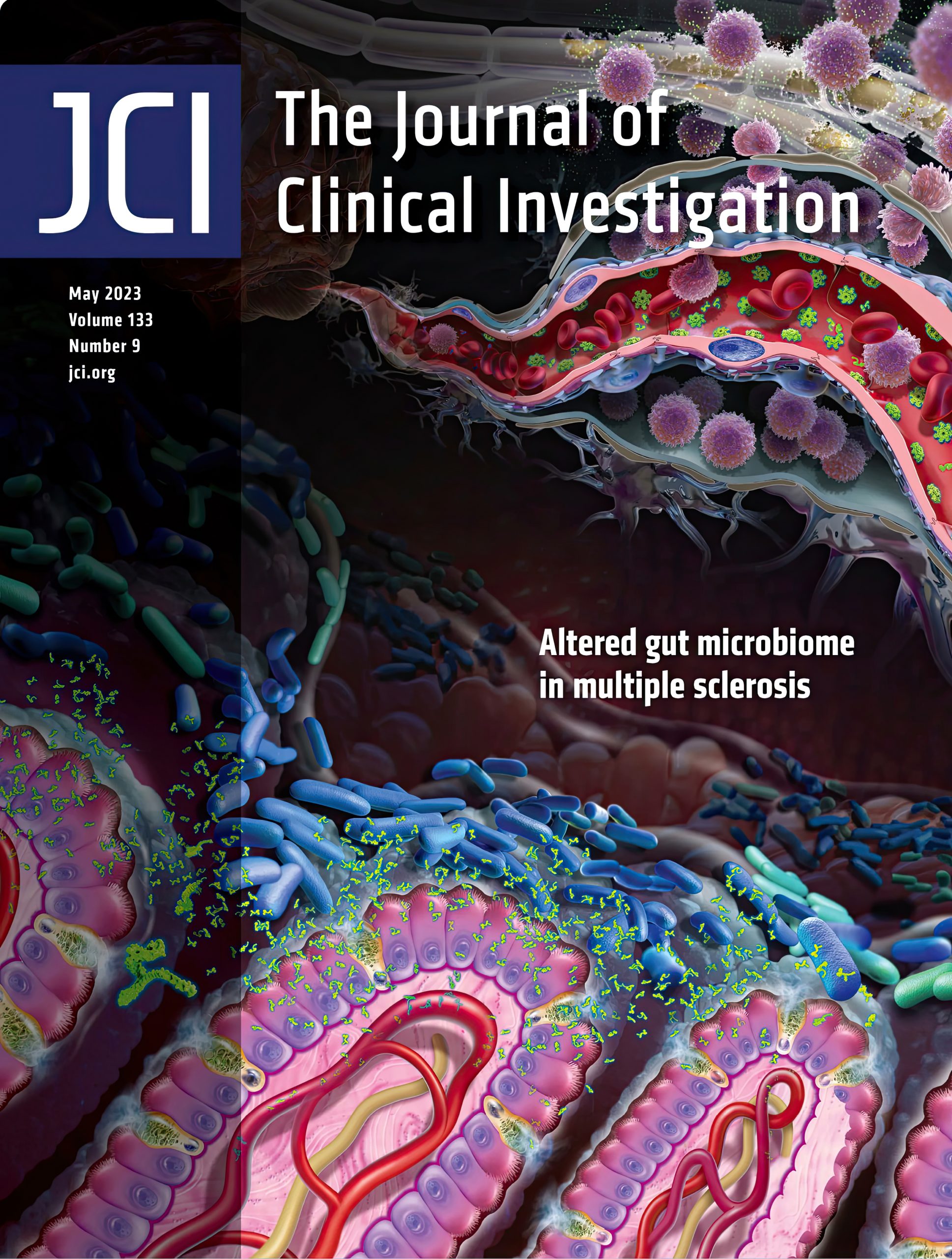
Very happy to share this cover art created by Audra Geras for the JCI!
Audra was commissioned by Dr. Tim Vartanian at Cornell to create this image showing how two epsilon toxin, ETX, producing strains of Clostridium perfringens, strains B and D, when found in the gut microbiome, appear to be implicated in demyelination damage of neurons in areas of the brain associated with multiple sclerosis. This important scientific research by Dr. Vartanian and his colleagues is impressive, exceptionally elegant work with the potential to lead to much-needed novel therapies for MS.
The lower left portion of the image shows both an ETX-producing strain (blue bacteria) in the mucus layer of the small intestine, as well as a non-toxin-producing strain (green bacteria). The ETX-producing bacteria are shown secreting ETX molecules that then enter the blood vessels in the intestinal villi. ETX is a pore-forming molecule. The formation of ETX pores in the endothelial cells of capillaries in the blood brain barrier (BBB) seen in the top right of the cover, damages the integrity of the barrier allowing the infiltration of myelin autoreactive CD4+ T lymphocytes into the brain parenchyma. These lymphocytes release inflammatory cytokines and cytokines that provide secondary signals to other cells in the immune cascade. This pathologic immune response leads ultimately to the destruction of the myelin insulation on neurons.
The challenges in creating this piece were both a crazy-short timeline, as well as the difficulty of depicting a story that takes place in multiple environments - the gut microbiome, the blood-brain-barrier and the brain parenchyma - all while staying aware of the title and copy placement on the cover.
Both Audra and Dr. Vartanian were very excited that this image was the final selection for use on the May, 2023 cover!
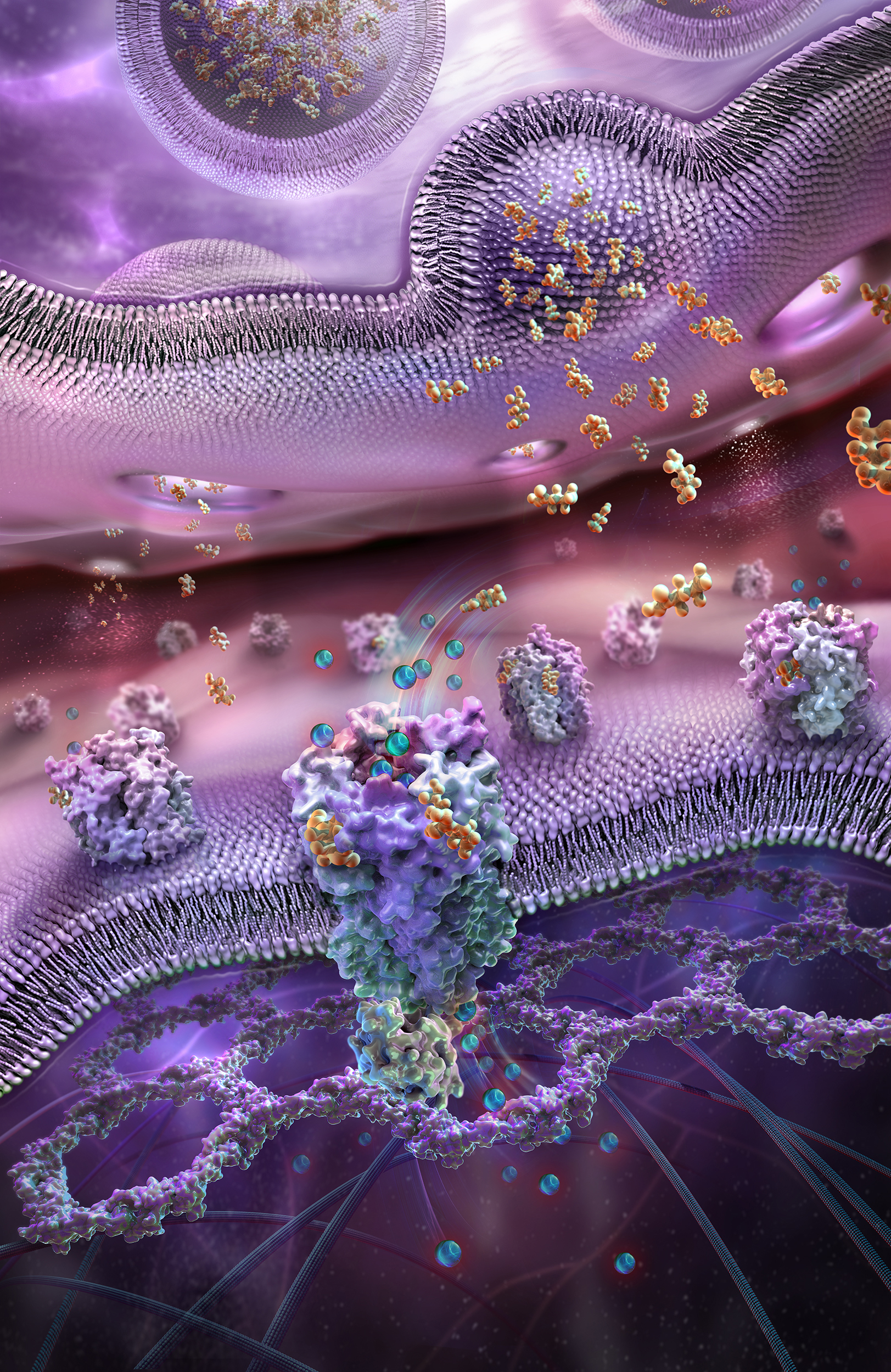
Very happy to announce that Audra's illustration, (shown below), Binding of GABAa Neurotransmitter Molecules to GABAa Receptor Complexes within a Synapse, won a 2021 Award of Excellence in the Association of Medical Illustrators annual adjudicated salon. Always a special honour to have your work recognized by your peers!
Audra submitted 2 illustrations to the salon this year. The 2nd, her illustration entitled Cells of the Retina, received an Award of Merit.
The illustration below depicts a view into a synaptic cleft to see GABA-A neurotransmitter molecules being released from presynaptic vesicles, then binding to pentameric, postsynaptic GABA-A receptor complexes.
GABA-A receptor complexes act as chlorine ion channels. The illustration shows chlorine ions moving through the channel into the postsynaptic neuron. The image also depicts a postsynaptic protein density lattice closely associated with the postsynaptic membrane. These lattices are very dynamic, both structurally and functionally and are believed to play a role in plasticity.
GABA-A receptors act to both hyperpolarize (excite) and depolarize (inhibit) neuronal action potentials, depending on complex regulatory influences. Nevertheless, they are generally considered to be the major inhibitory receptors in mammals.
Binding of specific molecules to these receptors results in a calming, anxiolytic, anti-seizure and pain reduction effect.
There are many drugs that exert their effects by binding to GABA-A receptors, including barbiturates, benzodiazepines and alcohol.
This illustration depicting the layers of the human retina is one of the most unusual and challenging images I’ve ever created. Designed as a wall mural, it is 6 times taller than it is wide!! The best way to view it is to imagine you are in a glass elevator that starts at the very bottom and then slowly moves up the height of the image allowing you to examine the startling complexity of each of the retinal layers.
Conceiving and creating this 3D illustration was so much fun, and as much an exercise in discovery for me, as it hopefully is for its viewers. I loved it! I certainly have a much more detailed understanding of the retina after all the research that was the necessary groundwork for its creation.
It is a fascinating fact that the arrangement of the human retina with the photoreceptors, (the rods and cones), placed in the 9th deepest layer is seriously counterintuitive, and almost seems like a design flaw. However, the more superficial layers are so transparent that light is still able to reach the photoreceptors. Interestingly, cephalopods (octopi, squid, cuttlefish…) did this much better. Their photoreceptors are found in the most superficial layer. Seems a superior design, wouldn’t you say?

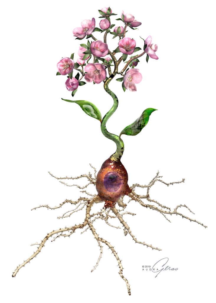
Neuroplasticity is a subject I have been extremely interested in ever since reading Dr. Norman Doidge’s ground-breaking and inspirational book, The Brain That Changes Itself. The illustration I'm featuring in this post was inspired by my continued reading on this fascinating subject, as well as my personal exploration of techniques used to encourage positive neuroplasticity.
This is a conceptual 3D image of a brain neuron whose axon ends in multiple blossoming branches. It symbolizes positive neuroplasticity. Neuroplasticity is defined as the brain’s ability to grow new neurons and neural connections. We now know that this growth takes place throughout our lifetimes and that we can promote the weakening of abnormal or negative neural pathways, using a variety of techniques, replacing them with new, healthier, or more positive neural pathways. This is of special importance in conditions such as OCD, generalized anxiety disorder and neuropathic pain. An understanding of neuroplasticity has also revolutionized the treatment of stroke patients and other brain injuries.
This flowering neuron, created in 3D in the look of blown glass, represents the possibility of directing positive neuroplastic changes in our neural pathways that may lead to a healthier and happier life.
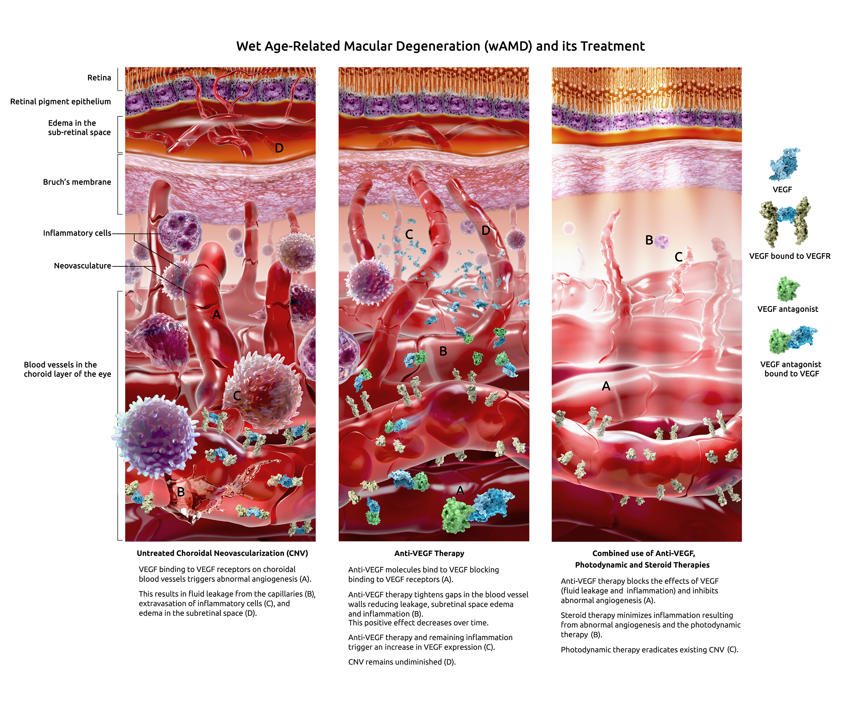
Wet Age-Related Macular Degeneration, wAMD, is a serious eye condition affecting primarily the elderly. Gradual degradation of the macula, the area of the retina that provides our sharpest focused sight, results in the loss of central vision. It also distorts remaining vision.
Central vision impairment has a devastating effect on quality of life as it makes driving, reading, general mobility, recognition of colours and faces impossible.
Wet AMD is the most common cause of vision loss affecting millions of individuals in North America every year.
This panel of 3 illustrations by Audra Geras shows the disease state and the changes seen with 3 commonly-used therapies.

Cosmetics research firm, Bella Aurora Laboratories, in Barcelona, Spain, recently installed one of Audra's paintings in the meeting room of their newly built research facility. This custom 3D mural of a melanocyte, (the skin cell type that produces skin pigmentation) was printed on fabric and backlit for maximum impact. So exciting to see the integration of Audra's art in this striking interior!
Here is a close-up of the art.

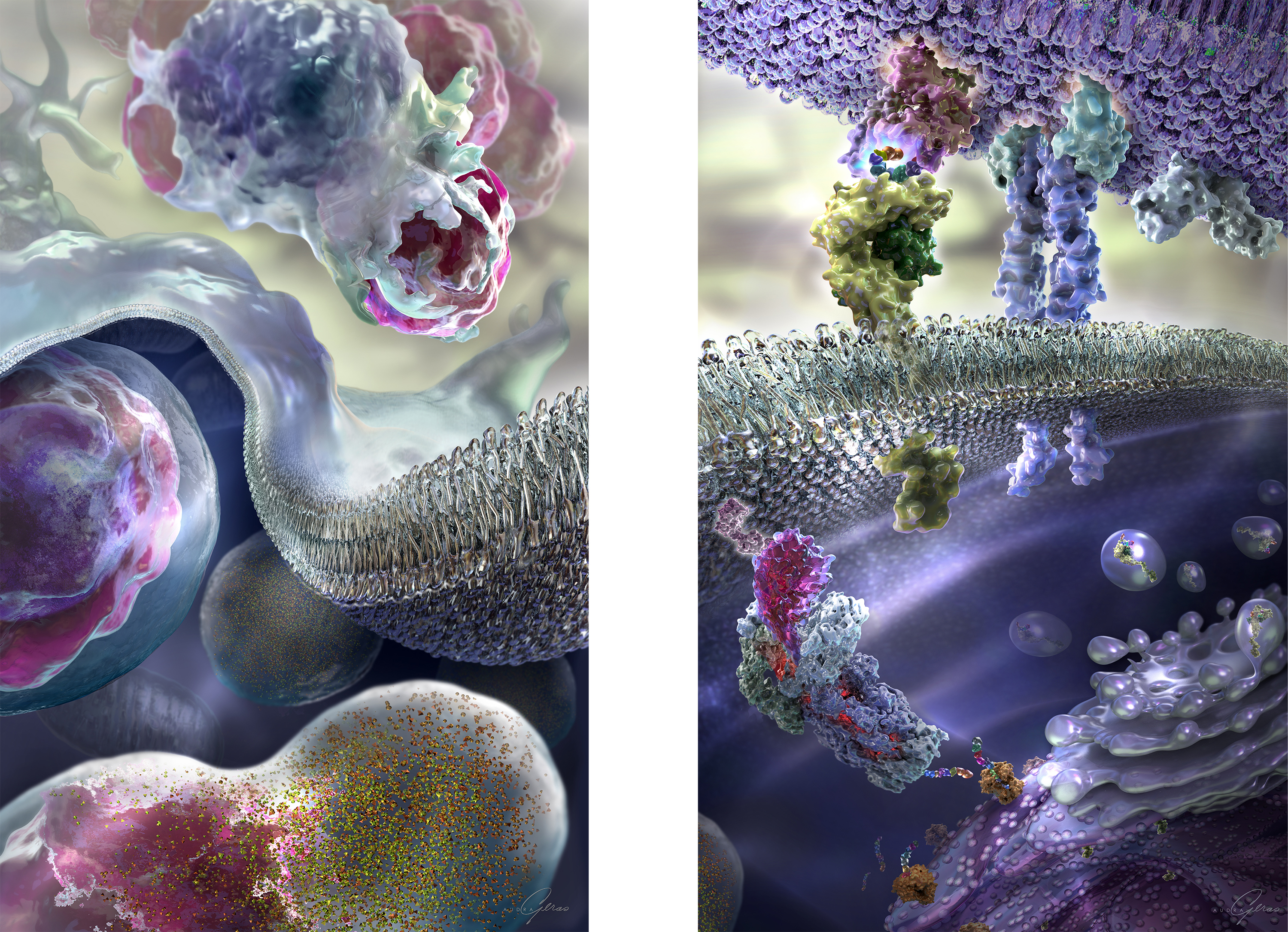
The last illustration we featured depicted tumor cell processing and presentation. This illustration has now become a diptych!
'Phagocytosis of Tumor Cells' is a new 3D painting created by Audra Geras to show the events that preceded antigen processing. Here is a look at this new diptych.
The diptych paintings are intended for a variety of uses. These include their exhibition as framed large-scale fine art giclées on canvas that are on permanent exhibit at Trillium Therapeutics Inc.
Is it possible there is a triptych coming soon?
